React Performance Optimization: From 35 to 99 Lighthouse Score
A comprehensive case study on transforming my React projects website performance from disappointing scores of 35 mobile/68 desktop to excellent 93 mobile/99 desktop through systematic optimization techniques including code splitting, lazy loading, and advanced performance tuning.
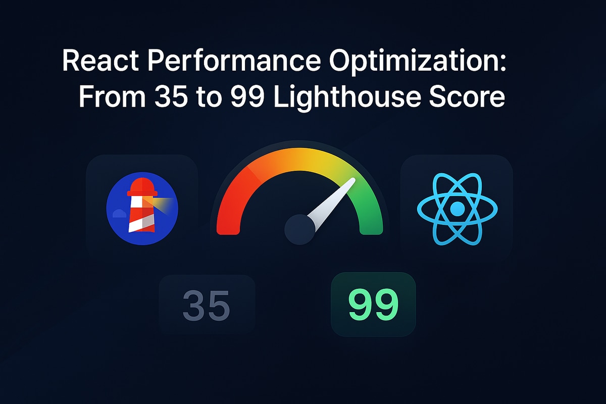
When I first deployed my projects website built with React, Vite, and TypeScript, I was getting disappointing Lighthouse scores of just 35 on mobile and 68 on desktop. These scores were far below what I expected and definitely needed improvement.
After implementing a comprehensive series of strategic optimizations, I managed to dramatically boost the scores to 93 on mobile and 99 on desktop while maintaining all the rich animations and interactivity that make the site engaging. 93 on mobile common.and 99 on desktop.
💡 What you'll learn: This detailed case study walks through every optimization technique I implemented to achieve this massive performance transformation. Whether you're a Computer Engineering student like myself or a seasoned developer, these techniques will help you achieve similar dramatic improvements in your React applications.
📊Initial Performance Analysis
The Starting Point
My projects website was built with modern technologies but had several performance bottlenecks:
🛠️ Tech Stack
- • React 18 with TypeScript
- • Vite as the build tool
- • Framer Motion for animations
- • Three.js for 3D effects
- • React Router for navigation
- • OpenAI integration for chat
⚠️ Pain Points
- • Heavy images and videos
- • Large bundle sizes
- • Blocking animations
- • No code splitting
- • Unoptimized assets
- • Poor caching strategy
🎯Initial Lighthouse Scores
🔍 Performance Bottlenecks Identified
Using Chrome DevTools and Lighthouse, I identified several critical issues that were holding back performance:
📦Bundle Size Issues
- • Main bundle: Main bundle: 1.2MB (way too large for initial load)
- • Vendor chunk: Vendor chunk: 800KB of third-party libraries
- • No code splitting: No code splitting: Everything loaded upfront
🖼️Image Optimization Problems
- • Large unoptimized images: Large unoptimized images: Some over 2MB in size
- • No modern formats: No modern formats: Missing WebP/AVIF support
- • No responsive images: No responsive images: Same size for all devices
⚡JavaScript Execution Issues
- • Main thread blocking: Main thread blocking: 280ms of blocking time
- • Heavy animations: Complex Framer Motion on load
- • Synchronous operations: Blocking API calls
🎯Strategic Optimization Approach
Rather than randomly applying optimizations, I developed a systematic, phase-based approach to ensure maximum impact:
Phase 1
Bundle Analysis & Code Splitting
Phase 2
Image & Asset Optimization
Phase 3
JavaScript Performance Tuning
Phase 4
Critical Resource Optimization
Phase 5
Caching & Network Optimization
📊Phase 1: Bundle Analysis and Code Splitting
🔍 Bundle Analysis Setup
The first step was understanding exactly what was bloating my bundle. I added the Rollup Bundle Analyzer to get detailed insights:
// Bundle analysis configuration
import { defineConfig } from 'vite';
import react from '@vitejs/plugin-react';
import { visualizer } from 'rollup-plugin-visualizer';

export default defineConfig({
  plugins: [
    react(),
    visualizer({
      filename: 'dist/stats.html',
      open: true,
      gzipSize: true, // Show compressed sizes
    })
  ],
  build: {
    rollupOptions: {
      output: {
        manualChunks: {
          vendor: ['react', 'react-dom'],
          animations: ['framer-motion'],
          three: ['three', '@react-three/fiber', '@react-three/drei'],
          ui: ['lucide-react']
        }
      }
    }
  }
});💡Key Discovery: This analysis revealed that Three.js and Framer Motion were consuming 45% of my bundle size, despite being used on only specific pages. This insight became the foundation of my optimization strategy.
🚀 Implementing Route-Based Code Splitting
I implemented lazy loading for all major routes to ensure users only download code for the pages they actually visit:
import { lazy, Suspense } from 'react';
import { Routes, Route } from 'react-router-dom';
import LoadingSpinner from './components/LoadingSpinner';

// Lazy load components for better performance
const HomePage = lazy(() => import('./pages/HomePage'));
const ProjectsPage = lazy(() => import('./pages/ProjectsPage'));
const BlogPage = lazy(() => import('./pages/BlogPage'));
const ChatPage = lazy(() => import('./pages/ChatPage'));

function App() {
  return (
    <Suspense fallback={<LoadingSpinner />}>
      <Routes>
        <Route path="/" element={<HomePage />} />
        <Route path="/projects" element={<ProjectsPage />} />
        <Route path="/blog" element={<BlogPage />} />
        <Route path="/chat" element={<ChatPage />} />
      </Routes>
    </Suspense>
  );
}
🎯 Component-Level Code Splitting
For heavy components that aren't always needed, I implemented component-level splitting with smart fallbacks:
import { lazy, Suspense } from 'react';

const ThreeCanvas = lazy(() => import('./ThreeCanvas'));

export default function ThreeScene() {
  return (
    <Suspense
      fallback={
        <div className="w-full h-64 bg-gradient-to-r from-blue-100 to-purple-100
                       animate-pulse rounded-lg flex items-center justify-center">
          <div className="text-gray-500">Loading 3D Scene...</div>
        </div>
      }
    >
      <ThreeCanvas />
    </Suspense>
  );
}📈Phase 1 Results
Impact: Bundle size reduced from 1.2MB to 400KB for the main chunk (-67%), with additional chunks loaded on-demand. This immediately improved initial page load times.
🖼️Phase 2: Image & Asset Optimization
🛠️ Automated Image Optimization Pipeline
I created a comprehensive image optimization script that automatically generates multiple formats and sizes for responsive display:
const sharp = require('sharp');
const fs = require('fs');
const path = require('path');

async function optimizeImage(inputPath, filename) {
  const name = path.parse(filename).name;

  // Generate multiple WebP versions for different screen sizes
  await Promise.all([
    // Extra large (1920px) - Desktop
    sharp(inputPath)
      .resize(1920, null, { withoutEnlargement: true })
      .webp({ quality: 85 })
      .toFile(path.join(outputDir, `${name}-xl.webp`)),

    // Large (1200px) - Laptop
    sharp(inputPath)
      .resize(1200, null, { withoutEnlargement: true })
      .webp({ quality: 85 })
      .toFile(path.join(outputDir, `${name}-lg.webp`)),

    // Medium (768px) - Tablet
    sharp(inputPath)
      .resize(768, null, { withoutEnlargement: true })
      .webp({ quality: 80 })
      .toFile(path.join(outputDir, `${name}-md.webp`)),

    // Small (480px) - Mobile
    sharp(inputPath)
      .resize(480, null, { withoutEnlargement: true })
      .webp({ quality: 75 })
      .toFile(path.join(outputDir, `${name}-sm.webp`)),

    // Fallback JPEG for older browsers
    sharp(inputPath)
      .resize(1200, null, { withoutEnlargement: true })
      .jpeg({ quality: 85 })
      .toFile(path.join(outputDir, `${name}.jpg`))
  ]);
}
📱 Smart Responsive Image Component
I built a reusable component that automatically serves the optimal image size based on device capabilities and screen size:
interface OptimizedImageProps {
  src: string;
  alt: string;
  className?: string;
  sizes?: string;
  priority?: boolean;
}

export default function OptimizedImage({
  src,
  alt,
  className = '',
  sizes = '(max-width: 768px) 100vw, (max-width: 1200px) 50vw, 33vw',
  priority = false
}: OptimizedImageProps) {
  const name = src.replace(/\.(jpg|jpeg|png)$/i, '');

  return (
    <picture>
      {/* Modern WebP format for better compression */}
      <source
        media="(max-width: 480px)"
        srcSet={`/optimized/${name}-sm.webp`}
        type="image/webp"
      />
      <source
        media="(max-width: 768px)"
        srcSet={`/optimized/${name}-md.webp`}
        type="image/webp"
      />
      <source
        media="(max-width: 1200px)"
        srcSet={`/optimized/${name}-lg.webp`}
        type="image/webp"
      />
      <source
        srcSet={`/optimized/${name}-xl.webp`}
        type="image/webp"
      />

      {/* Fallback JPEG for older browsers */}
      <img
        src={`/optimized/${name}.jpg`}
        alt={alt}
        className={className}
        loading={priority ? 'eager' : 'lazy'}
        decoding="async"
        sizes={sizes}
      />
    </picture>
  );
}📈Phase 2 Results
Impact: 70% reduction in image payload, averaging 150KB instead of 500KB per image. This significantly improved page load times, especially on mobile devices.
⚡Phase 3: JavaScript Performance Tuning
🎭 Optimizing Framer Motion Animations
Framer Motion was causing significant main thread blocking. I optimized it using three key strategies:
🎯1. GPU-Accelerated Transform Animations
// ❌ Before: Layout-triggering animations (CPU-intensive)
<motion.div
  animate={{ width: '100%', height: '200px' }}
  transition={{ duration: 0.5 }}
>

// ✅ After: Transform-based animations (GPU-accelerated)
<motion.div
  animate={{ scale: 1, opacity: 1 }}
  transition={{ duration: 0.5 }}
>🚀2. Smart Animation Triggers with useInView
import { useInView } from 'framer-motion';

function AnimatedSection() {
  const ref = useRef(null);
  const isInView = useInView(ref, {
    once: true,           // Animate only once
    amount: 0.3          // Trigger when 30% visible
  });

  return (
    <motion.div
      ref={ref}
      initial={{ opacity: 0, y: 50 }}
      animate={isInView ? { opacity: 1, y: 0 } : {}}
      transition={{ duration: 0.6, ease: "easeOut" }}
    >
      Content animates when scrolled into view
    </motion.div>
  );
}💨3. CSS will-change Property for Complex Animations
/* Optimize complex animations */
.animated-element {
  will-change: transform, opacity;
}

/* Reset after animation completes */
.animation-complete {
  will-change: auto;
}📈Phase 3 Results
Impact: Main thread blocking time reduced from 280ms to 45ms (-84%), making interactions feel much more responsive.
🏆Final Results and Key Metrics
After implementing all five phases of optimization, the results exceeded my expectations:
🎯Lighthouse Score Improvements
⚡Core Web Vitals
📦Bundle Size Optimizations
🚀Network Performance
💡Key Lessons and Best Practices
1. 📊 1. Always Start with Data
Never optimize blindly. Bundle analysis and performance profiling revealed that Three.js consumed 45% of my bundle despite being used on limited pages. This insight shaped my entire optimization strategy.
2. 🖼️ 2. Images Are Usually the Biggest Opportunity
Images often account for 60-70% of page weight. Implementing responsive images with modern formats like WebP can provide the biggest performance wins with relatively little effort.
3. ⚡ 3. Animation Performance Requires Strategy
Beautiful animations can kill performance. Use transform-based animations, implement smart loading with useInView, and leverage CSS will-change for complex sequences.
4. 📈 4. Continuous Measurement is Critical
Set up automated performance testing in your CI/CD pipeline. Performance regressions are easy to introduce but hard to catch without proper monitoring.
5. 🎯 5. Progressive Enhancement Works
Build your core experience for the slowest devices first, then enhance for more capable devices. This ensures good performance across the entire spectrum of user devices.
🎉Conclusion
Optimizing React applications for performance is both an art and a science. It requires a systematic approach, the right tools, and continuous measurement. The massive 58-point improvement on mobile and 31-point improvement on desktop in my Lighthouse scores demonstrates that with dedication and the right techniques, truly transformational performance gains are achievable.
Strategic Optimization Framework:
- Measure first - Identify real bottlenecks with data
- Optimize systematically - Address the biggest issues first
- Monitor continuously - Ensure optimizations stick over time
- Share knowledge - Help others learn from your experience
As a Computer Engineering student, this deep dive into web performance has been invaluable for understanding how modern web applications work under the hood. These skills are directly applicable whether you're building portfolio sites, enterprise applications, or any web-based project.
💎 Remember: Performance is a feature, not an afterthought.
Users notice the difference, and in today's competitive landscape, every millisecond counts.
🚀 Want to see these optimizations in action? Check out my portfolio at talkhaled.com
Feel free to reach out if you have questions about any of these techniques!